
A Response to Digital Saturation
Over the past decade, our lives have become increasingly digitized and connected. While this brings efficiency, the fast-paced rhythm of modern life has triggered a deep need for a sanctuary—a place of refuge. Amidst the hustle of screens and notifications, the home remains our final fortress.
This explains why color trends for 2026 are shifting decisively toward the Calm Palette and Earthy Tones. We are seeing a rejection of loud, overstimulating colors in favor of shades that are grounding, soothing, and timeless.
This trend is not merely about aesthetics; it is a conscious choice to use design as a visual therapeutic tool, where every corner of a room contributes to the relaxation and mental wellness of its inhabitants.

Photo by Prophsee Journals on Unsplash
The Three Essentials of Earth Tone Dominance – The dominance of earth tones and the calm palette is supported by several key design philosophies.
1. Biophilic Connection
Earthy colors such as terracotta, light brown, and olive green inherently remind us of the outdoors—forests, clay, and meadows. Using these colors creates a biophilic connection, helping to reduce stress and improve focus.
2. Wabi-Sabi and Timelessness
A calm, understated palette tends to be timeless and pairs effortlessly with natural materials like raw wood, stone, or linen. These colors never go out of style and support the Wabi-Sabi aesthetic, which values imperfection and natural textures, making a home feel lived-in yet serene.
3. Visual Noise Reduction
In an era of open-plan living and multi-functional rooms, walls in calm colors act as a neutral canvas that reduces visual noise. This is crucial in workspaces or family rooms, which are often filled with gadgets, toys, and other functional items.

Photo by Kelly Sikkema on Unsplash
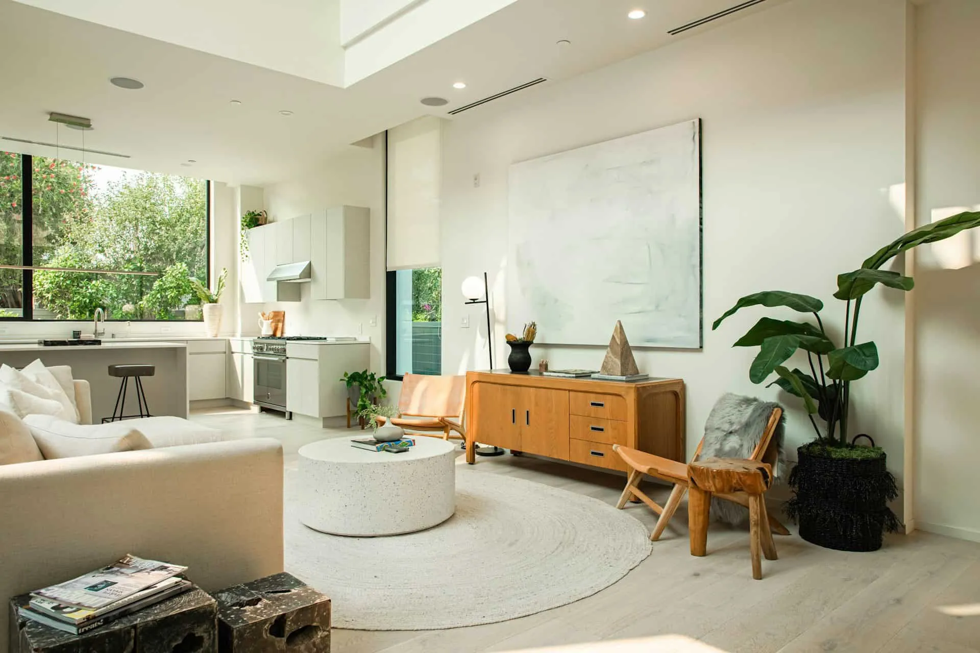
Key Colors That Will Define 2026 – Several specific colors will take center stage in this year's Calm Palette.
•• Sage Green: This is the dominant hue. Sage green is not just a plant-based green, but a green infused with gray or cream, providing a soft, tranquil, and earthy impression. It is perfect for bedrooms, offering a soothing effect like being in the great outdoors.
•• Rich Cream and Warm Beige: Moving beyond cold whites, the creams and beiges of 2026 feature warm yellow or brown undertones. These colors make a room feel cozy and inviting, radiating a soft glow—ideal for living and dining rooms.
•• Terracotta and Deep Browns: These are used as accents to provide depth. Terracotta, derived from the color of clay, adds texture and warmth. Dark browns can be used in wooden furniture or accent walls to provide "grounding" and a sense of luxury.
•• Muted Blue: Used to create a calming aquatic feel. Blue mixed with gray or deep green is perfect for bathrooms or meditation spaces, providing a sense of peace and order.

Photo by Elina Sitnikova on Unsplash
Tips for Applying the Calm Palette–You don’t need to repaint your entire house to follow this trend.
Update your pillowcases, curtains, and blankets with sage green, linen beige, or terracotta tones. Textiles are the easiest and fastest way to shift the mood of a room. Utilize natural materials, add handmade earthy ceramics, jute rugs, or wooden furniture that isn't overly polished. Texture is the best partner for a calm palette. – Ensure you use warm lighting (warm white or below 3000K). Cold light can ruin the soothing effect of earth tones. Warm light will make your creams and beiges look rich and comfortable.

Photo by NMG Network on Unsplash
WRAP-UP!
The 2026 color trend is a reminder that design is not about following fleeting fashions; it is about improving the quality of life. By choosing a calm palette and earthy tones, we actively create a home that functions as a refuge—a place where the mind can rest, stress can be managed, and energy can be recharged.
Which room in your home needs the soothing effect of sage green or rich cream the most? Share your small transformation plans!